Ome Branding
We chose the name Ome as it pulled together three key values of the company: the importance of creating products for the home that involved tech; ohm, a unit of measurement to measure electrical resistance; and ohme, a yoga and meditation reference, that represented the creation of convenience and calm in users’ lives.
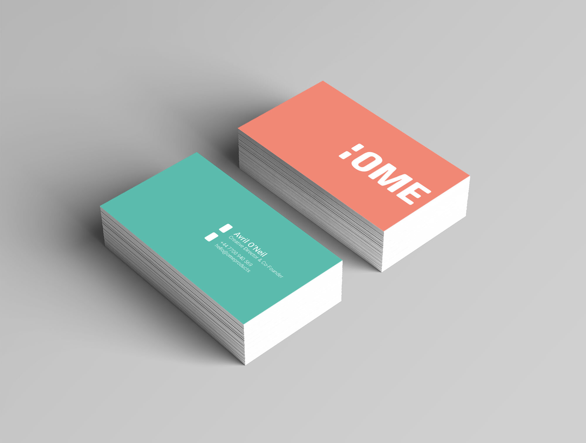
We worked in collaboration with Biblioteque to develop the name and identity. The two dots within the logo subtly suggest the missing H in “home” by highlighting the negative space. They also give room to use the logo in a naming convention for future product lines. The strong brand was designed to stand out from competitive mass market products.
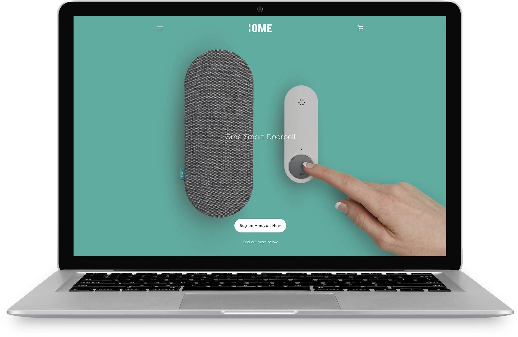
When we implemented the branding within the website design, we wanted to predominantly let the photography shoot we’d created speak for itself. With a combination of simple images showing off the product, situational photography testimonials and simple illustration, we created a website that guided the consumer through the complexity of the product in a simple and understandable way.

Ome Packaging
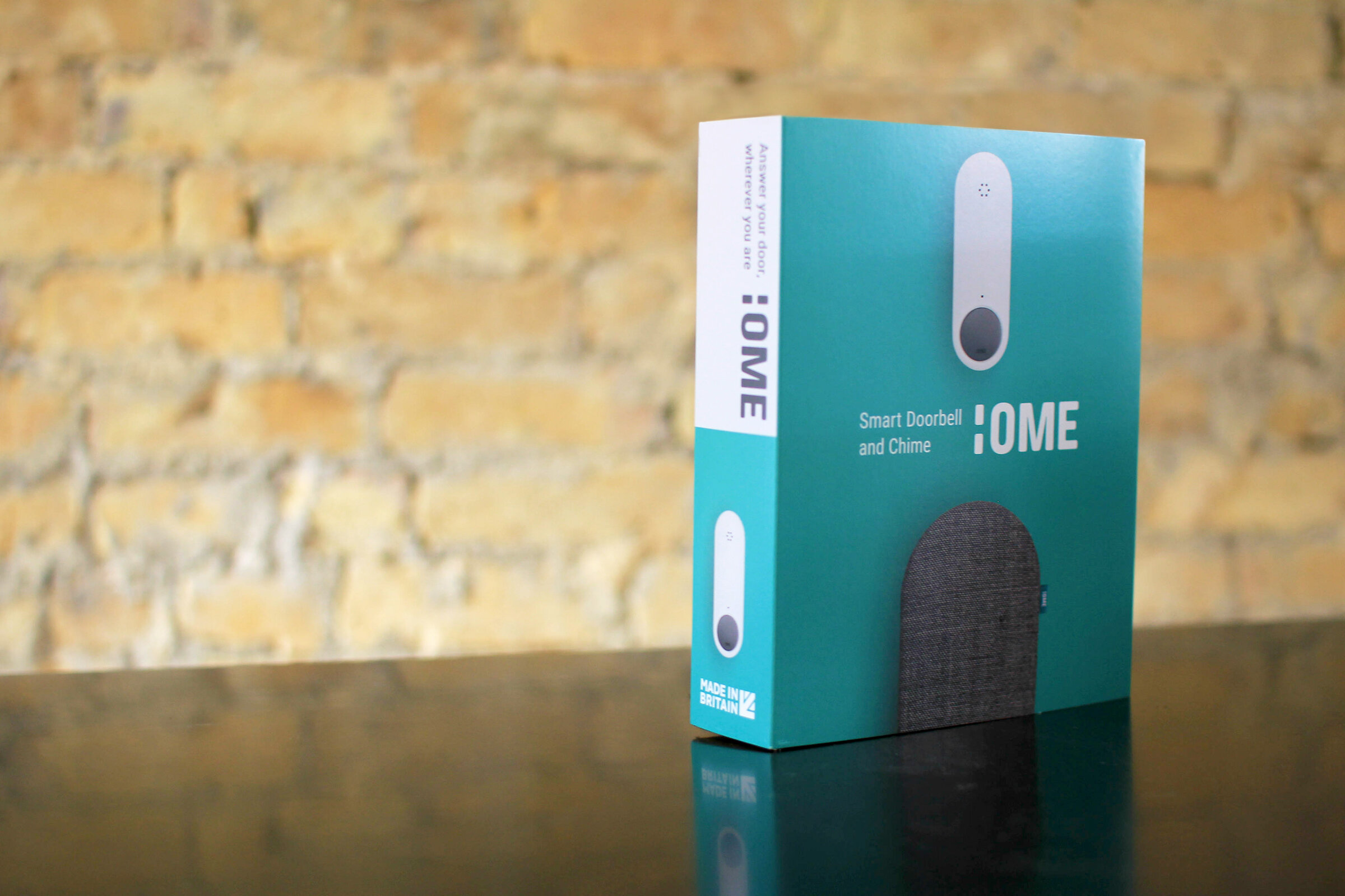
The new branding needed to be implemented throughout all elements of the product, including the packaging design. In collaboration with Burgopak, we designed packaging constructed from 100% recyclable materials. The packaging played an important role in how users installed and understood the product. By intuitive placement of products at different staggered heights within the packaging, the design guides users through installation, alongside the step by step app setup.
We also wanted the packaging to stand out from our competition. A frequent trend within smart home products is to display the product on the packaging sleeve clearly against a white background. We chose to be bold with colour and stand out, whilst maintaining a clean aesthetic to guide the purchaser through what the product does.
Unboxing is a particularly important part of a product’s life, a really special moment where the user is excited about setting up their new purchase. We designed our packaging to be minimal and guide the user through the setup. When opening the packaging, the products within are staggered at different heights, in order of how you interact with them during setup. Firstly, a leaflet guides the user to where the app can be installed. The app guides you to the next most accessible part, the ‘button’, which is setup first. Then, beside this, sits the ‘chime’ with accessories beneath them for the final stage of physical installation.